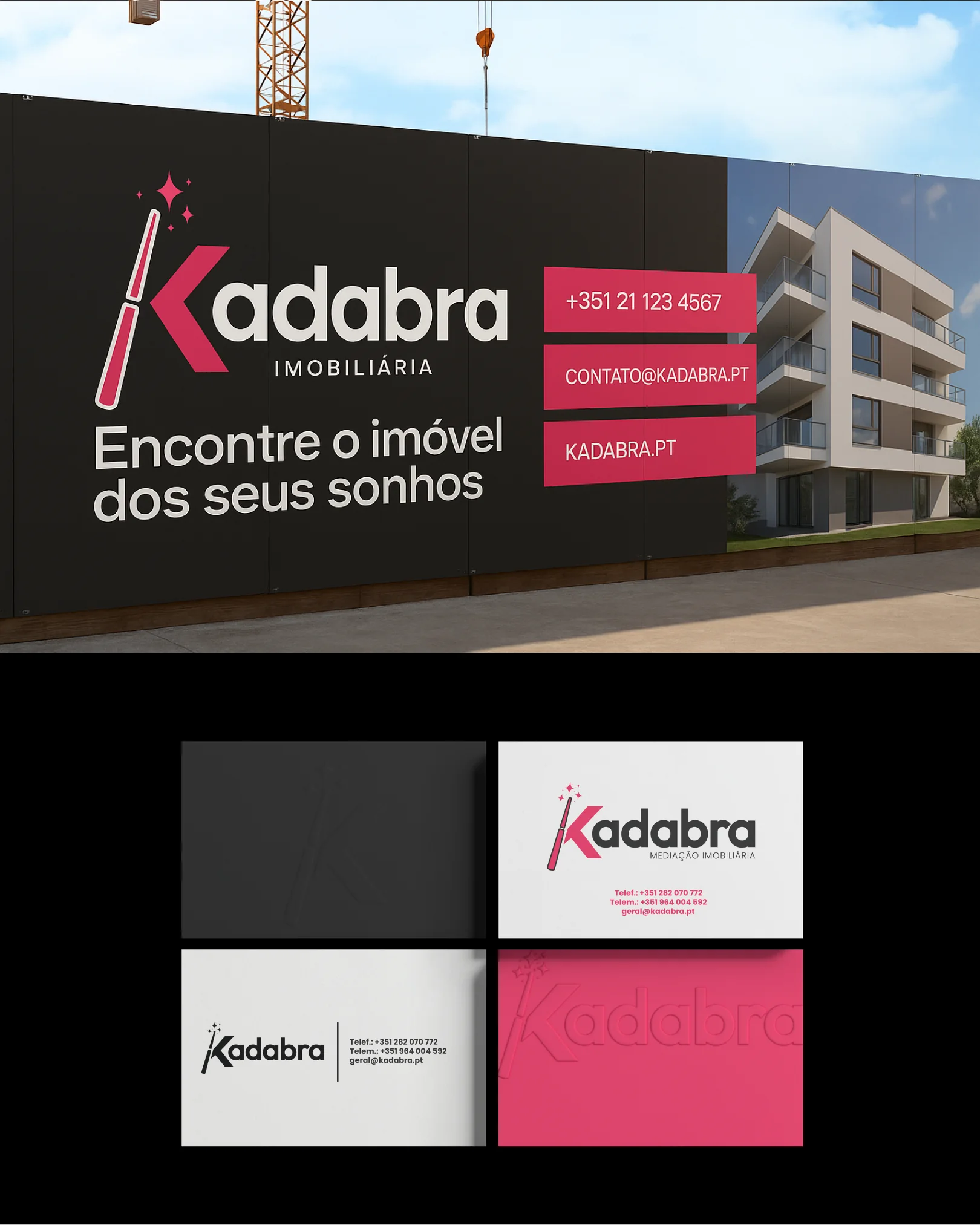
Branding
Kadabra
- Client
- Kadabra Real Estate
- Service
- Branding
- Year
- 2025
What have we done?
A Kadabra é uma marca que nasceu para dar um toque de magia ao setor imobiliário e o branding que desenvolvemos foi pensado para refletir exatamente isso.
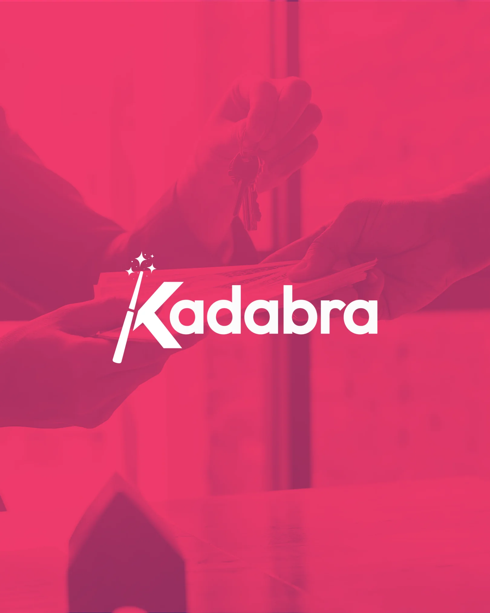
With a striking logo and a visual identity that combines sophistication with boldness, Kadabra's new image stands out at first glance. The use of vibrant pink conveys dynamism, confidence and innovation, while solid black balances it with professionalism and authority in the market.
The graphic symbol of the magic wand, integrated into the brand's initial, represents Kadabra's commitment to simplifying what seems complex and enchanting every step of the real estate journey. From the naming to the final design, each element communicates proximity, modernity, and a distinctive positioning in the sector.
At Apollotec, we don't just create beautiful brands, we create brands with purpose. Kadabra is a reflection of this: branding that speaks directly to its audience and positions the company as a modern, accessible and memorable estate agency.
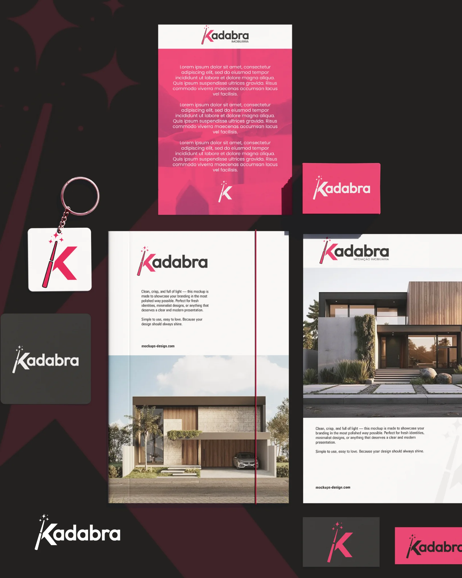
Identity
A single accent colour on a neutral base: the magenta takes whole surfaces — flaps, contact bars, cards — while black, graphite and paper white carry everything else.
- Magenta Kadabra#EA4872
- Preto#0D0C0C
- Grafite#3E3C39
- Papel#EAEAEA
Display
Logotype and headlines
Bold
Text
Descriptor, body copy and contact details
Regular · Medium